A psychrometric chart for a given location can tell you information about temperature (wet bulb and dry bulb) and humidity (relative and absolute). While they may seem overwhelming at first, by learning how the variables interact, you can begin to use the psychrometric chart to interpret occupant comfort and effective passive design strategies for your location.
|
|
|
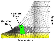
Psychrometric charts show temperature vs. humidity, and can be used to express human thermal comfort, design strategies, and energy requirements for those strategies. |
What is a Psychrometric Chart ?
A psychrometric chart is a graphical representation of the psychrometric processes of air. Psychrometric processes include physical and thermodynamic properties such as dry bulb temperature, wet bulb temperature, humidity, enthalpy, and air density.
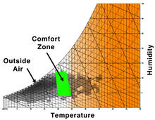
A psychrometric chart can be used in two different ways. The first is done by plotting multiple data points, that represent the air conditions at a specific time, on the chart. Then, overlaying an area that identifies the “comfort zone.” The comfort zone is defined as the range within occupants are satisfied with the surrounding thermal conditions. After plotting the air conditions and overlaying the comfort zone, it becomes possible to see how passive design strategies can extend the comfort zone.
 |
| Example of how plotted data on a psychrometric chart can be studied, and related to passive design. In this chart, the dark blue boxes represent the comfort zone, and the other colors represent design strategies that have been enabled to study how they can potentially expand the comfort zone. This psychrometric chart was generated using Climate Consultant. |
The chart is also often used by mechanical engineers to dynamically plot points that represent the exterior air conditions and understand the process the air must go through to reach comfortable conditions for the occupants inside a building. When using the psychrometric chart for this purpose the data points move around the chart.
 |
| Psychrometric charts show temperature vs. humidity, and can be used to express human thermal comfort, design strategies, and energy requirements for those strategies. |
Anatomy of the Psychrometric Chart
Temperature
Every psychrometric chart includes vertical lines that represent the dry bulb temperatures. Air temperature increases from left to right.
 |
| Dry bulb temperature lines on a psychrometric chart |
Every psychrometric chart also includes wet bulb temperatures. These lines are indicated at diagonals, and like dry bulb temperatures they increase from left to right.
 |
| Wet bulb temperature lines on a psychrometric chart |
Relative Humidity
Another feature indicated on every psychrometric chart is relative humidity lines. These lines are curved, and begin at 100% along the top of the chart, and decrease moving downward. It is fairly common for these lines to be indicated in intervals of ten.
 |
| Relative humidity lines on a psychrometric chart |
Data Points
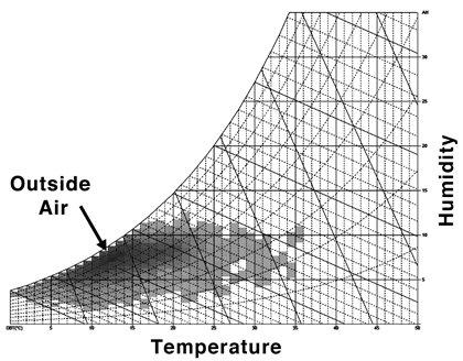
Psychrometric charts indicate data points for each location they are representing. The style of the data points can vary depending upon the computer application that was used to generate the psychrometric chart, or if the chart was generated by hand. Each data point represents a collection of air qualities at a snap shot in time. It can be hourly, daily, monthly, or even seasonal data. The density of data points on the chart is used to decipher average conditions. At times it can be useful to view summer and winter data points independently. But viewing them together allows you to consider all passive design strategies in an integrated manner.
 |
| Based on the data points in this example, we can conclude average conditions are between 30° C and 35° C. |
Comfort Zone
The comfort zone is typically indicated by shading a portion of the psychrometric chart. This shaded area is highly variable per climate and project. The comfort zone is either populated by a software system, or manually by a designer, based upon the activity to take place in the building and the level of anticipated clothing to be worn by the occupants.
 |
| In this example, we know temperatures greater than 30° C will be considered too hot, and less than 20°C will be considered too cold. |
Other items that can be found on some, but not all psychrometric charts, are as follows.
- Horizontal lines that provide dew point temperature readings along the right hand side of the chart. This is useful for knowing at what temperature water will begin to condensate. Which can transpire to mold and insulation with decreased thermal performance if not accurately accounted for in the design of a building.
- Horizontal lines that provide humidity ratio/moisture content measurements along the right hand side of the chart. This information aids with understanding the density of the air, which relates to buoyancy and air quality issues.
- Along the upper left hand side of the chart at times will be diagonal ticks/lines placed at a similar angle and direction as the wet bulb temperature lines. These are enthalpy measurements that are useful for understanding heat energy needed, or existing in the air.
Interpreting the Psychrometric Chart
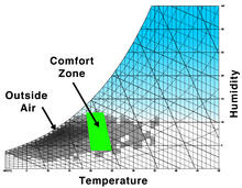
Since psychrometric charts can provide you with a rapid overview of air conditions as they relate to occupant comfort, some steadfast judgments can be made. For example, is your climate hot and humid, or dry and arid? How are your occupants going to feel most of the time—too hot, too cold, or comfortable?
Some common examples of these broad conclusions are depicted below.
 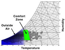 |
| Temperature (orange = too hot, blue = too cold) |
  |
|
Humidity (blue = too humid, yellow = too dry |
Design Strategies and the Psychrometric Chart
After understanding how your climate reads on a psychrometric chart, you can use it to understand what sustainable design strategies can be best used to improve occupant comfort.
When data points fall to the right of the comfort zone, you will want to reduce the air temperature. An example strategy to achieve this would be to increase air flow with natural ventilation.
When data points fall to the left of the comfort zone, you will want to increase the air temperature. A common strategy to do this passively is to incorporate solar heat gains with high thermal mass materials.
When relative humidity is too low it can be increased with evaporative cooling. And when it is too high it can be decreased with the use of desiccants.
An example of how this sort of analysis could be done is demonstrated below. Climate Consultant was used to generate all the charts.
 |
|
Beginning psychrometric chart, with comfort zones depicted for summer and winter clothing levels. The chart also indicates that only 9.5% of occupants will be comfortable with no design strategies. |
 |
| Natural ventilation is applied to reduce air temperatures, and occupant comfort moves up to 10%. |
 |
| Opportunities for passive solar gain are combined with high mass materials, in order to raise air temperatures. As a result, occupant comfort moves up to 29.1%. |
 |
| Humidification is combined with passive heating, and occupant comfort reaches 98.9%. |