“To create architecture is to put in order. To put what in order? Function and objects.” – Le Corbusier
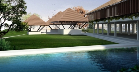
The winners of the 2011 India BIM competition designed a campus health and wellness center by following the philosophy that form should follow function. Although studying the climate helped them shape and orient building, it was equally important for them to understand human emotions so they could choose design features and materials to foster human health and happiness. For more information about the design, see the sustainable design highlights below and the student's final presentation.
Passive Design
The climate in India lends itself well to passive design strategies. The team started by studying how the sun and wind moved on the site. They thought they wanted to orient a linear building along the east-west axis, and conceptual energy analysis in Vasari proved that this was indeed energy-efficient compared to other alternatives.
The north side of the building has a lot of glass and openings to take advantage of daylight, while the south side of the building uses creeper vines to both block-out strong southern sun and allow views into a sunny courtyard.
This orientation also allows the building to take full advantage a pleasant 10km/hr breeze that often comes from the north on the site. This will help keep occupants comfortable despite the high temperatures and humidity that the site can experience.
Also, the team used thermal mass in the walls and floors of the doctor’s offices to control the flow of heat so that it remains cool during the day.
Sustainability and Human Wellness
The project evokes a meditative calm with its human scale, open floor plan, and pleasant courtyard. The team chose raw, natural materials like concrete and terracotta to give the feeling of comfort, while also evoking a pristine and healthy atmosphere. When project reviewers commented that the building felt like a resort, they knew they’d met their goal!
Design Process
The team started with a one-day design session where they worked, sketched, and brainstormed together to establish the basic building concepts and form. From there they used Vasari, Revit, and Ecotect to fully articulate the design, improving both the the energy use and the quality of the space.
![]() Download the team's final presentation.
Download the team's final presentation.


